How to Use Google Analytics for Your UX Research: Part 1

If your product is your website or app, you have a unique opportunity to improve your product in a way that most physical products do not. Like a huge opportunity, compared to, for example, a car or an appliance company.
If you’re not taking advantage of all the data to understand how customers use your product and improve, then you’re missing out on additional revenue.
This blog will focus on eCommerce websites. In the future, we will launch another article that will cover how to do the same thing for analytics for firebase. If you want it sooner, let us know, and we’ll hurry up in writing it!
Google Analytics can give you hints about user behavior that you can’t find otherwise - and the mighty thing about product analytics is that you get to “watch” what people are doing when they think no one is watching. It sounds creepy, but it really isn’t.
The Most Useful Reports in Google Analytics for User Experience Research
Audience Reports
Check Your Users Preferred Browsers and Devices
Does 70%+ of your traffic come from mobile? Do you spend 70%+ of your design time on mobile?
Often we forget that we have the data right in front of us to decide where we should be prioritizing new development.
If you are an eCommerce business and you aren’t thinking about the mobile experience, you will find yourself behind the curve.
While it’s pretty normal to see your conversion rates lower on mobile than on desktop, shopping is shifting more to mobile devices, especially if you accommodate the mobile experience.
The Technology -> Browser & OS report will also help you pinpoint what browsers your customers use most. Once again, prioritizing your testing to make sure you're doing the most extensive testing on the browsers that send you the most traffic and revenue will improve your user experience measurably.

Device category report in Universal Google Analytics
2. Demographics Are Important (check that report too)
One of the silliest things we see happen with most businesses is that they have solid user personas that their brand team created. Then, they proceed to not only ignore those personas they created when considering user experience design, but they also don’t check to make sure that those personas are actually showing up in the data!
It’s one thing to have a theory about who your ideal customer is - it’s another to see what’s actually working.
Demographics/geo/interest reports show who is using your site. Segment that further and see who is actually converting. Is it the same as your user personas? Is there another persona/user group that you weren't considering that is using your product?
Adjusting how you present a site based on your audience is going to improve your user experience (and if you want help validating your user personas, you can take a look at our brand consulting services)

As you can see in this example, there is a difference in the ages of converters and non-converters on the site. Looking deeper into the other demographics reports and interests could tell a story about who your customers are, really.
Behavior Reports
Here, you can see how customers enter your site, where they go, and where they leave from.
Comparing this information with how you “expect” customers to move through your site can show you unexpected flows, pain points, and more.
Check top pages engagement
The behavior -> site content -> all pages report and related reports are a great way to see the most visited pages on your site and their engagement metrics. You also can see page value, which is an interesting metric to get an idea of the revenue importance of pages.
Understanding which pages are high value and which pages may be having some engagement issues (like a low time on page or a high exit rate) can help you craft new content and consider things like how to re-work your menu items in the future
Page value is ((transaction revenue + total goal value) / the unique pageviews)

The page report in Google Analytics
About exit rate - while exit rate can be an interesting way to understand where customers leave your site, it isn’t a key performance metric. Everyone has to leave sometime, so look at the exit rate through the lens of “did they leave where I expected them to?”
If there is a high exit rate on the order confirmation page, that’s pretty expected. If there is a content page that should lead customers to more information and has a high exit rate, you may want to examine that page to see why.
2. Site Speed
While UX designers might not want to think that one of the main purposes of their job is to improve site speed, it absolutely is.
Since user experience is poor when the site doesn’t load as expected, you should be obsessed with improving your site speed to as fast as f*cking possible (AFAFP). Yes, we coined that.
Paid advertising and organic search engines reward you for speed by improving your placements, AND site speed is directly correlated to conversion rate. One of the easiest ways to improve your conversion rate is to have an AFAFP site. Looking at which pages are slowing you down is a key way to stay on top of your site speed issues.

3. Behavior Flow
The behavior flow report is nowhere as beautiful in Google Analytics as Adobe Analytics (cue wistful sigh about Adobe’s butterfly charts); the behavior flow is one of the most useful and easy-to-understand visualizations about the biggest majority of customers do from page-to-page in Google Analytics.
If your top landing pages have 80% of people exiting, but you can see that other paths lead to purchase or to more content, then you know where you can begin improving.
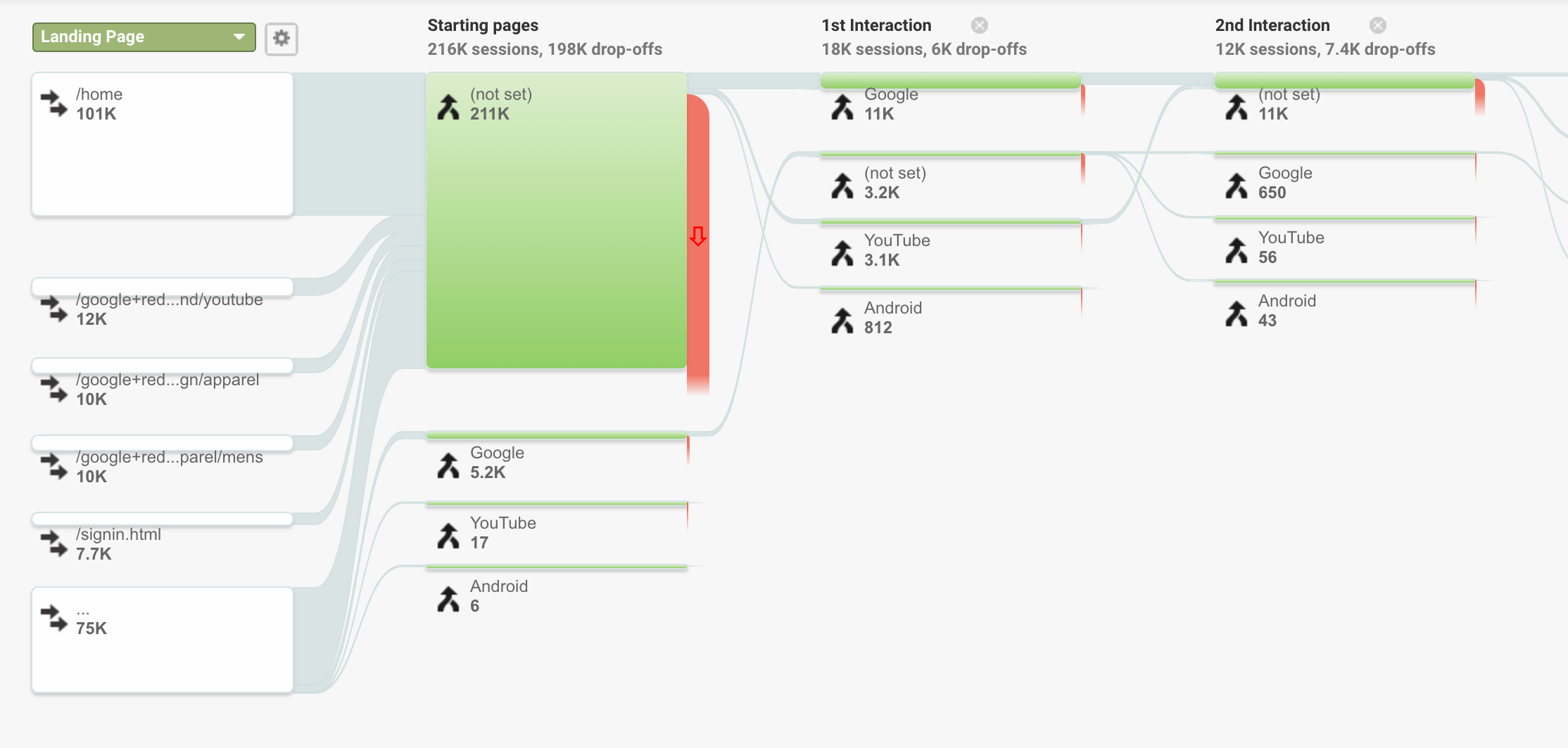
Here is the Google Analytics behavior flow - note that in this example from the Google Analytics demo account, there is an implementation or tracking issue that is contributing to the high volume of “not set” starting pages.
To Sum Up…
There are obviously so many other reports and data in Google Analytics that can help with UX research that we didn’t touch on, but hopefully, this gives you somewhere to start.
You don’t need to be a huge eCommerce site to see enough data to give you ideas on improving. These days the competition is fierce. In the US, you are competing with Amazon (even if you’re selling there as well), who will always outman and outgun you with their analytics and design resources.
Focus on the best user experience possible. People are shopping online more than ever, and they want a great experience. You don’t need to be Amazon to look at your data and find where their experience is less than ideal, and you certainly don’t need to be Amazon to create an AFAFP site.
Let’s get squeezing!
Ready to learn how to take full advantage of the data your company creates? Our data strategy and analytics experts are standing by to help you with your next data-driven project.


“Insight Lime creates surveys for my company that make us seem far smarter, bigger and more accomplished than we are...Just far surpassed what I expected.”